Design System User Validation UX Research Lead ResearchOps · Design Governance

Restoring Confidence
in SSA's Design System

I led the design and execution of a multi-phase, mixed-methods research program to validate and operationalize the Social Security Administration's design system after years of untested component growth during COVID.

UX Research Lead · Research Governance
Cross-Functional · 5 Members
Desktop · iOS · Android
Social Security Administration
2023–2024 · Multi-phase
The Governance Gap — SSA Design System Timeline diagram showing SSA design system governance state before COVID, the COVID disruption event, and the resulting five-year post-COVID gap. Before COVID: library guerrilla testing provided validation, design team autonomy provided governance, in-person protocols provided infrastructure, and evidence-based decisions built trust. Post-COVID five-year gap: patterns shipped untested with no validation, no escalation process for governance, no remote testing infrastructure, and eroded stakeholder confidence. The design system is built on USWDS, the federal design standard. THE GOVERNANCE GAP PRE-COVID COVID POST-COVID GAP VALIDATION Library guerrilla testing NO VALIDATION Patterns shipped untested GOVERNANCE Design team autonomy NO GOVERNANCE No escalation process INFRASTRUCTURE In-person protocols NO INFRASTRUCTURE No remote testing in place TRUST Evidence-based decisions ERODED TRUST Stakeholder confidence lost ← 5-year gap → Built on USWDS — the federal design standard
Scroll to explore
15+
Patterns Validated
5yrs
Usability Backlog Cleared
25+
System Updates Implemented
60+
Federal Products Impacted
200M+
Annual Digital Interactions
3
Governance Processes Launched

A Governance Gap That Grew for Years

The SSA Design System is the shared foundation for 60+ public-facing and internal applications supporting millions of Americans navigating Retirement, Disability, SSI, and Survivors benefits. When COVID-19 halted in-person usability testing, components continued to ship without formal validation — and the organization had no infrastructure for remote testing at scale.

By 2024, this had created more than a backlog. It was a systemic governance failure: teams were building high-stakes federal services on patterns that had never been validated with real users. Accessibility compliance was at risk. Stakeholder confidence had eroded. And the agency's FY25 modernization milestones depended on a design system no one could fully trust.

The challenge wasn't simply to test components. It was to rebuild evidence-based governance from the ground up — in a way that would outlast any single research initiative and expand organizational capacity in the process.

This Wasn't a Component Problem. It Was an Organizational One.

Unvalidated patterns weren't just a UX concern — they represented compliance risk, modernization blockers, and trust failures at national scale. For users navigating disability applications under financial or health stress, even minor friction is a barrier to completion.

The mandate required a research leader who could operate at two levels simultaneously: rigorous enough to produce defensible findings, and strategic enough to translate those findings into governance decisions that would scale across dozens of products and outlast the initiative itself.

Governance Risk

No process defined who owned pattern decisions, how findings were escalated, or when patterns required re-validation. Knowledge was tribal. Drift was inevitable.

Accessibility Risk

Patterns in production across 60+ applications had never been validated for WCAG compliance, cognitive load, or assistive technology compatibility.

Trust Risk

Sensitive identity fields — gender, pronouns, sex at birth — were deployed without testing with affected communities, risking harm at millions-of-interactions scale.

Modernization Risk

FY25 mobile-first milestones required validated mobile patterns. Without a cross-platform program, modernization efforts were built on an unstable foundation.

A Research Program Built to Govern, Not Just Inform

I designed and led SSA's first post-COVID, cross-platform design-system validation program — a structured, multi-phase initiative that paired mixed-methods usability research with durable ResearchOps infrastructure and hands-on practitioner training.

The solution wasn't a study. It was a governance model — one that produced validated patterns, prioritization frameworks, and institutional processes that would continue operating long after the research team moved on.

The result: a COVID-era backlog cleared, 25+ design-system updates implemented, 3 new governance processes launched, and 5 non-UX practitioners enabled to carry validation forward — all in service of 200M+ annual digital interactions.

01
Two-Phase Cross-Platform Validation

Structured desktop and mobile studies with 23 participants across 4 device platforms — generating defensible, cross-platform evidence for governance decisions.

02
Mixed-Methods Research Design

Behavioral metrics, qualitative observation, and attitudinal measures triangulated to surface findings that task-success rates alone would have missed.

03
ResearchOps Infrastructure

Standardized protocols, centralized repositories, severity scoring, and biennial re-testing cycles — transforming research from episodic activity to organizational standard.

04
Governance-Ready Recommendations

Every finding translated to component updates, token-level changes, and process enhancements — packaged to drive immediate action, not future consideration.

How might we validate untested design-system patterns — across desktop and mobile — while rebuilding internal confidence and capacity for continuous usability validation?

This question shaped every decision: method selection, participant design, synthesis approach, and how findings were packaged for governance. The answer had to be reusable — not a one-off study.

Requirement 01
Cross-Platform Evidence

Findings needed to hold across desktop, iOS, and Android — not just validate a single context.

Requirement 02
Defensible Prioritization

With 15+ patterns to evaluate, severity × confidence scoring was essential to focus governance decisions.

Requirement 03
Behavioral + Emotional Data

Task success rates alone would miss the trust and comfort signals critical to high-stakes federal services.

Requirement 04
A Model That Scales

The program had to produce reusable infrastructure — protocols, templates, and trained practitioners — not just a report.

Research Authority Across the Full Lifecycle

As UX Research Lead and Research Governance owner, I was accountable for both research rigor and organizational sustainability. My scope extended well beyond facilitation — it encompassed program strategy, cross-functional alignment, ResearchOps infrastructure, and team enablement.

I independently designed the end-to-end research strategy, led a team of 5 researchers, and defined how evidence translated into governance decisions affecting 60+ applications. The dual mandate — produce rigorous findings and build lasting capability — shaped every choice.

Strategy, Program Management & Planning
  • Owned end-to-end program strategy across a multi-phase, multi-platform initiative with 1 designer, 2 researchers, 2 apprentices, and vendor partner
  • Managed project timelines, milestones, and cross-functional dependencies against FY25 modernization deadlines
  • Led stakeholder alignment and prioritization across design, engineering, and product organizations
  • Secondary research, design audit, and use-case definition to scope the validation program
Risk Management
  • Identified and mitigated governance risk of releasing unvalidated patterns at scale across 60+ production applications
  • Defined severity × confidence scoring to triage which patterns posed immediate versus deferred risk
  • Flagged high-risk patterns (file error recovery: 54% fix rate; date picker comprehension: 38%) before system-wide reuse
  • Managed the risk of inclusive identity fields deployed without testing with affected communities — preventing harm at national scale
Research Design & Execution
  • Mixed-methods study design across two platforms and 23 participants
  • Screener development, vendor management, prototype direction
  • Moderated usability testing, structured interviews, Comparative Preference Test
  • Cross-functional workshops to translate findings into design mandates
ResearchOps & Governance
  • Standardized testing protocols and centralized findings repository
  • Severity × confidence scoring framework for prioritization
  • Re-testing cycles embedded into governance standards
  • Trained and mentored 5 non-UX practitioners to extend validation capacity

Why Mixed Methods Were Required

This problem could not be solved with a single method. Each method was chosen to answer a specific class of governance question — not to produce data for its own sake.

📊
Behavioral Metrics

Task success rates, error frequency, path deviation, and recovery behavior — measured per pattern and per platform.

Governance question: Which patterns fail at scale, and how severe is the risk?
💬
Qualitative Observation

Think-aloud protocols and post-task structured interviews capturing confusion, hesitation, emotional friction, and trust signals.

Governance question: Why do failures happen, and how do they undermine user trust?
❤️
Attitudinal Measures

5-point Likert surveys measuring perceived helpfulness, clarity, and comfort — critical for inclusive identity fields in high-stakes contexts.

Governance question: Does friction affect confidence and willingness to proceed — not just efficiency?
Triangulation
Behavioral data: where users struggle Qualitative: why it matters Attitudinal: trust impact confirmed Severity × confidence → governance action
Study Design

Two Phases. Four Platforms. 23 Participants.

Primary Study Aim

Evaluate the usability, accessibility, and emotional trust of 15 core UEF 3.0 design-system patterns across desktop and mobile — surfacing behavioral breakdowns, cognitive friction, and trust signals for users navigating high-stakes federal benefit services. Each pattern is scored using a severity × confidence framework to determine development readiness, with passing patterns advancing to FY25 production. A secondary objective assessed design preference across three Expand/Collapse Accordion variants.

Shared Protocol · Applied to Both Phases

Format

Moderated · One-on-one · 60-minute sessions · Think-aloud protocol throughout

Prototype

6-step "Apply for Disability" application hosted on Axshare Cloud

Session Team

1 facilitator · 1 moderator · 1+ notetaker per session

Metrics

Task success/fail · Error rate · Post-task Likert scale · Qualitative sentiment

Participants

Inclusive of male, female, and nonbinary · Ages 18–65 · Prior interaction with SSA digital services required

Post-Task Assessment

Likert-scale questionnaire via screen share · Semi-structured interview administered as informal Q&A

Task Success Definition

Scenario completion without facilitator intervention · Failures logged by severity for escalation scoring

Analysis & Synthesis

Post-session debriefs consolidated pass/fail scores, Likert results, and qualitative observations into a pattern-level analysis spreadsheet; findings were then mapped against severity × confidence criteria before escalation.

Phase 1

Desktop Validation · Baseline

July 22 – August 6, 2023
Remote · Moderated via Zoom
10 · 4 male, 3 female, 3 nonbinary · Ages 18–65 · Median age 42.5
Laptop or desktop — single platform tested
Baseline usability · Cognitive alignment · Accessibility pain points · Expectation mismatches · Emotional trust signals
10 participants · Single platform required no subgroup stratification
Phase 2

Mobile Validation · Cross-Device

March 6 – 13, 2024
In-person · Controlled Lab via Zoom for session recording
13 · 4 male, 5 female, 4 nonbinary · Ages 18–65 · Median age 38
iOS smartphone · iOS tablet · Android smartphone · Android tablet (3–4 per device)
Touch fluency · OS-specific conventions · Cross-device behavioral consistency · Emotional trust signals
5±2 rule applied per device subgroup — 10 per device would require 40 participants, creating unacceptable delivery timeline risk. Optimized for diminishing returns across four platforms.
Parallel replication of Phase 1 protocol across mobile device types — same tasks, measures, and scenarios applied to assess whether patterns held across platforms

Recruitment & Screening Criteria · Both Phases

Recruitment

  • Recruited via Field Goals, a third-party vendor
  • National recruitment · Geographically diverse pool
  • SSA customers — members of the general public

Eligibility Criteria

  • Age 18–65 · Stratified: 18–49 / 50–62 / 63–65
  • Prior interaction with SSA digital services
  • English proficiency required — reading, writing, speaking, and comprehension
  • Comfortable with everyday technology · Able and willing to screen share via Zoom
  • No educational requirement

Consent & Privacy

  • Informed consent form completed and signed before each session
  • Consent to audio and video recording required
  • No identifiable data linked to participants
  • SSA-205 Demographics Questionnaire administered prior to tasks

Why this was sufficient: The goal was decision reliability, not statistical generalization. Patterns were escalated only when risks appeared consistently across multiple data sources, or were severe enough that scaling would harm real users. Requiring nonbinary representation in both phases was non-negotiable — the only way to get valid signal on sensitive identity patterns.

Patterns Embedded in Realistic Context

Rather than testing patterns in isolation, we embedded all 15 into a realistic 6-step "Apply for Disability" prototype — so we could evaluate how patterns performed under authentic task pressure, not abstract UI review. Participants experienced patterns the way real users would: in sequence, under cognitive load, with real emotional stakes.

Design System Test Prototype

Applying for Disability Journey

The Axure prototype was structured as an end-to-end Disability benefits application journey.

Participants were given a specific scenario: you are a dual citizen living abroad who needs to apply for disability benefits. You go to the SSA website, find the link to apply, and begin.

I chose this scenario intentionally — one of the patterns under test was Address (International), and we needed participants to have a realistic reason to interact with it. A dual citizen living overseas provided that naturally: international address entry wasn't a forced task, it was just part of applying.

View Desktop Prototype View Mobile Prototype
Step 01
Welcome
Patterns
  • Public Template 2
Focus
  • Entry clarity
  • CTA prominence
Template
Step 02
About You
Patterns
  • Address (International)
  • Gender Identity
  • Sex Listed at Birth
  • Pronouns
  • Link Confirmation Modal
Identity + Modal
Step 03
Medical History
Patterns
  • Button Group Dialog
  • File Input
  • Error Messages
Focus
  • Upload affordance
  • Error recovery & tone
Upload + Error
Step 04
Schedule
Patterns
  • Date Picker
  • Alert (Compact)
Focus
  • Tap targets & states
  • Messaging clarity
Date + Alert
Step 05
Review
Patterns
  • Accordion Pattern
Focus
  • Expand/collapse clarity
  • Edit discoverability
Accordion
Step 06
Confirmation
Patterns
  • Confirmation Alert
Focus
  • Submission clarity
  • Screen reader support
Confirmation
Patterns Validated TemplatesAddress InternationalGender IdentitySex Listed at BirthPronounsLink ModalFile Upload + ErrorsDate PickerCompact AlertsAccordionConfirmation Alert
Central Insight

Functional Success ≠ Usability

The most important finding wasn't a failed pattern. It was the gap between what metrics showed and what users experienced.

High completion rates masked emotional friction, comprehension failures, and trust erosion — the signals that matter most in high-stakes federal services. Without mixed methods, these patterns would have been marked "good enough."
Gender Identity Field
100% task success · Desktop
Open text format created uncertainty. No opt-out path — forcing engagement with a politically charged question for users who wanted to skip.
Date Picker · "Today" Indicator
100% date selection · 38% comprehension mobile · iPad: 0%
Users completed the task, but 62% misunderstood what the circle meant. Functional success masked a comprehension failure that would scale to millions.
File Upload Error Recovery
100% error ID (desktop) · 54% fix rate (mobile)
Adobe PDF icon red collided with error red. Users couldn't match errors to files — a failure at the most stressful step of a disability application.
"

I support inclusivity, but this question caught me off guard. I wasn't expecting it here, and it made the experience feel less comfortable.

Study Participant · Gender Identity Field · Desktop Study

This quote captures the core tension of the entire program: a user who values inclusive design still experienced discomfort — not because of the intent, but because of the absence of a graceful exit. Emotional usability isn't about content; it's about control.

Evidence-Driven Recommendations

Testing surfaced two distinct failure modes across the full pattern set: emotional harm from patterns that were functionally correct but socially uncareful, and behavioral breakdowns where comprehension and error recovery diverged sharply by platform. Both required different governance responses.

Failure Mode — Emotional Trust

Patterns that passed every functional metric but caused emotional friction, coercion, or trust erosion — consistently across both desktop and mobile. High Likert scores masked low emotional safety.

🪪

Gender Identity Field

100%task success

All participants completed the field — but success masked polarized reactions. Some valued flexibility; others were deeply offended by the question's presence. The opt-out ("prefer not to share") felt coercive rather than a genuine choice. Likert helpfulness avg: 4.38/5 desktop, 4.26/5 mobile — strong on clarity, weak on emotional safety.

Governance Actions
  • Add true 'Skip' / 'N/A' option to bypass the gender identity block entirely
  • Consider multi-select with "other: specify" — nonbinary participants found open text too limiting
  • Inclusive design principle: representation without pressure requires a genuine opt-out path
🏷️

Pronouns Pattern

60%negative perception · desktop

Despite 90% task completion, 60% of desktop participants reacted negatively. Nonbinary participants were specifically offended by lowercase pronouns in helper text — a grammar error that signaled carelessness. Mobile Likert avg 4.26/5 for helper text clarity suggests the example text itself works; the pattern design and opt-out path are the failure points.

Governance Actions
  • Fix immediately: capitalize "For example:" in helper text — flagged across both studies
  • Switch from single text input to multi-select with "other: specify"
  • Add 'N/A' skip path for the entire gender identity section
📋

Sex Listed at Birth

100%success · all platforms

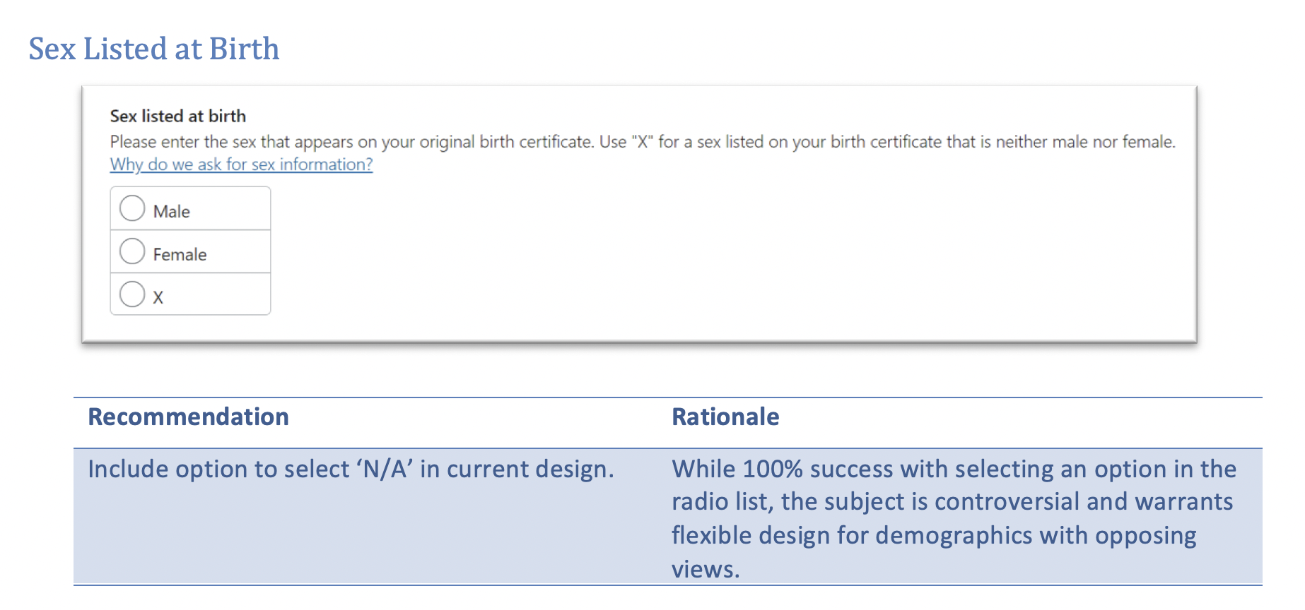
Technically flawless across every device. Likert: 4.78/5 helpfulness, 4.5/5 ease of understanding. The design itself is not the issue — but two desktop participants called it "very controversial" and "ridiculous." The problem is forcing engagement with no graceful exit. A targeted fix — not a redesign.

Governance Actions
  • Add 'N/A' option to the radio group — low-effort, high-impact for users who object or find it irrelevant
  • No functional redesign needed — this is a scoped governance fix, not a pattern overhaul
🎥

Pattern Deep Dive: Inclusive Identity Fields Introduce Cognitive & Emotional Friction

What this clip demonstrates

Task success alone did not capture the pattern risk. The interaction shows how inclusive identity fields can still introduce hesitation, uncertainty, and emotional friction when users do not understand why the information is being requested or how much control they have.

  • Behavioral hesitation before engaging with sensitive identity fields
  • Trust risk created by unclear context and perceived lack of control
  • Need for clearer framing, sequencing, and a genuine opt-out path

Failure Mode — Behavioral Breakdown

Patterns where task completion rates were high but platform-specific interaction behaviors — hover vs. tap, layout width, OS conventions — caused comprehension failures and error recovery breakdowns that only surfaced on mobile.

📅

Date Picker · "Today" Indicator

38%"Today" circle comprehension · mobile · iPad: 0%

All participants successfully selected a date — but the circle marking "Today" was widely misread as a selection indicator rather than a reference point. On desktop, comprehension was higher with more deliberate cursor behavior allowing users to read the calendar at rest. On mobile — particularly iPad — the larger touch targets and tap-first interaction removed the hover pause that helped desktop users orient. Zero iPad participants understood the indicator's meaning without prompting.

Governance Actions
  • Replace the circle with a "Today" text label alongside the visual indicator — tested and confirmed in cross-platform rollout
  • Strengthen the focus-ring token to distinguish selected state from reference state across all device sizes
  • Prioritize for immediate system update — comprehension failure at this scale would affect every date-entry interaction across 60+ applications
📁

File Upload · Error Recovery

54%successful error fix rate · mobile

Desktop participants identified file upload errors at 100% — but mobile recovery dropped sharply. The root cause: the Adobe PDF file-type icon used the same red as the error state indicator, causing users to confuse the icon with the error message itself. On desktop, participants could read error text at a glance alongside the filename. On mobile, the compressed layout and icon-color collision made it impossible for nearly half of participants to match the error to the correct file — the most stressful moment in a disability application.

Governance Actions
  • Explicitly link each error message to its source filename in text — remove reliance on visual proximity alone
  • Introduce distinct semantic color tokens for error state vs. file-type icon to eliminate collision
  • Mobile layout adjustment: stack error messages directly beneath their associated file row
"

I could see something was wrong — there was a red icon — but I couldn't tell which file it was. I didn't want to delete the wrong one and have to start over.

Study Participant · File Upload Error Recovery · Mobile Study

This moment — paralysis at the point of error — is the exact failure the research was designed to surface. The participant wasn't confused by the concept of uploading a file. They were stopped by a color collision and a layout that worked on desktop but broke under real conditions on mobile. Task completion metrics would have called this a pass.

Divergent Findings · Where Platforms Split

Convergent Finding · What Both Platforms Confirmed

Date Picker Comprehension

Desktop users hovered before clicking — creating a natural reading pause. Mobile users tapped first. This behavioral difference, not design intent, drove the comprehension gap. iPad scored lowest: largest screen, tap-only, zero comprehension without prompting.

File Upload Error Recovery

Desktop's wider layout let error messages and filenames coexist visually. Mobile's compressed column collapsed that relationship. The icon-color collision compounded a layout problem that only appeared at smaller viewport widths.

Button Order & OS Convention

iOS users expected Cancel before Save; Android and desktop users expected Save first. A single convention regardless of platform created friction that only surfaced on mobile. Fix: Save → Cancel standardized per OS context.

Emotional Friction Was Platform-Agnostic

The most important convergent finding: emotional discomfort with inclusive identity fields was not a desktop problem or a mobile problem — it was a design problem. Likert helpfulness scores were nearly identical across both studies (Gender Identity: 4.38 desktop / 4.26 mobile; Pronouns: consistent negative sentiment on both). Platform did not mediate the experience. The absence of a graceful opt-out caused the same harm regardless of device — confirming that the fix had to be at the pattern level, not the platform level.

Research-Backed Pattern Recommendations

We validated 15 design patterns across desktop and mobile experiences. While task completion rates were high, several patterns revealed a critical gap: users could successfully complete tasks but did not feel in control or trust why sensitive information was being requested. The following patterns are highlighted because they most clearly illustrate this tension between usability success and emotional risk.

Gender Identity pattern recommendation
Gender Identity — Recommendation & Rationale
Pronouns pattern recommendation
Pronouns Pattern — Recommendation & Rationale

Designing Research as Infrastructure

From the outset, this program was designed to outlast itself. The goal wasn't a report — it was a repeatable validation capability embedded into the organization's governance model and carried forward by practitioners who didn't start as researchers.

ResearchOps Foundations

  • Standardized testing protocols and reusable session templates
  • Centralized findings and decision repository for institutional memory
  • Severity × confidence scoring to prioritize governance fixes defensibly
  • Biennial re-testing cycles embedded as governance requirements — not suggestions
  • Replaced misapplied SUS survey with task-based component-level validation, moving the team from 0 to 1 on rigorous design system research

Capacity Building

  • Trained 5 non-UX practitioners through hands-on facilitation workshops across the full research lifecycle
  • Shifted usability testing from an isolated UX function to a shared organizational capability
  • Mentored practitioners in screener review, session facilitation, and findings synthesis
  • Expanded internal validation capacity under resource constraints without sacrificing methodological rigor
  • Embedded training as a ResearchOps lever — not a one-time knowledge transfer

Findings Became Standards

Research findings are only as valuable as the systems that act on them. Every insight from this program was translated into component updates, token-level design changes, and governance processes — not recommendations in a slide deck.

The governance model defines how patterns enter the system, who reviews them, when they require re-validation, and how decisions are documented — creating institutional memory that persists well beyond any individual researcher or project cycle.

Component Updates
  • Inclusive fields → "Prefer not to answer" + true skip option added
  • Link Confirmation Modal → redirect on desktop, overlay on mobile
  • Date Picker → "Today" text label + stronger focus-ring token
  • Button Order → Save → Cancel standardized per OS convention
  • File error messages → explicitly linked to source file by name
Token-Level Updates
  • Color contrast raised to ≥4.5:1 (color.accent.default / hover)
  • Semantic state tokens introduced: focus, hover, error, success
  • Spacing and radius tokens updated for tap-target accessibility
  • Typography tokens scaled for mobile–desktop parity
Process Enhancements
  • Storybook Pattern Validation Checklist — required gate for every component release
  • Token compliance audit added as pre-release requirement
  • Biennial re-testing cycles scheduled for all interactive components

What This Program Delivered

Design System Impact

  • 15 core patterns validated across desktop, iOS, and Android
  • 25 design-system updates implemented at component and token level
  • COVID-era validation backlog fully cleared
  • 60+ applications modernized with evidence-backed patterns
  • High-risk patterns flagged before system-wide reuse — preventing failures from reaching millions of users
  • First sensitive-pattern playbook for inclusive identity fields delivered to SSA

Organizational Impact

  • 3 new governance processes launched: Storybook checklist, token audits, biennial re-testing
  • Research embedded as a governance standard — not a project deliverable
  • 5 non-UX practitioners trained and enabled to support continuous validation
  • Repeatable ResearchOps infrastructure established for future cycles
  • Stakeholder confidence in design system restored, unblocking FY25 modernization milestones
  • 200M+ annual digital interactions now supported by validated, accessible patterns

Customer Impact

  • Inclusive identity fields now offer a genuine opt-out — users can engage on their own terms, not be forced into a choice that felt coercive
  • Clearer error guidance when uploading medical documents — users can recover confidently at the most stressful step of a disability application
  • Improved contrast, labeling, and affordances that meaningfully aid older adults and low-vision users navigating federal services
  • More predictable, consistent behavior across all devices — reducing cognitive load for vulnerable users completing high-stakes applications
  • Greater confidence that applications are being submitted correctly — less anxiety, fewer errors, and fewer abandoned sessions
Reflection

Leadership Judgment & What I'd Do Differently

The most important outcome wasn't validated components — it was a culture of evidence. Research at the design-system level has disproportionate impact: one validated pattern reaches millions. An unvalidated one carries millions of small harms.

This project reinforced that effective research leadership means operating at two levels simultaneously: rigorous enough to surface findings that hold under scrutiny, and strategic enough to translate those findings into governance decisions that survive team rotations, project changes, and institutional pressure.

Balancing rigor with speed required deliberate tradeoffs. Under resource constraints, I prioritized cross-platform consistency and decision reliability over larger sample sizes per pattern — accepting smaller subgroups in exchange for defensible governance decisions. Patterns were escalated only when risks appeared consistently across multiple data sources or when the severity of scaling failure was high enough to justify action.

If I were starting again, I would integrate emotional-trust metrics even earlier in the synthesis process. Their influence on inclusive design decisions — particularly for sensitive identity fields — proved stronger than anticipated. Functional success rates alone would have led to very different, and far less human, governance conclusions.